Key Takeaways
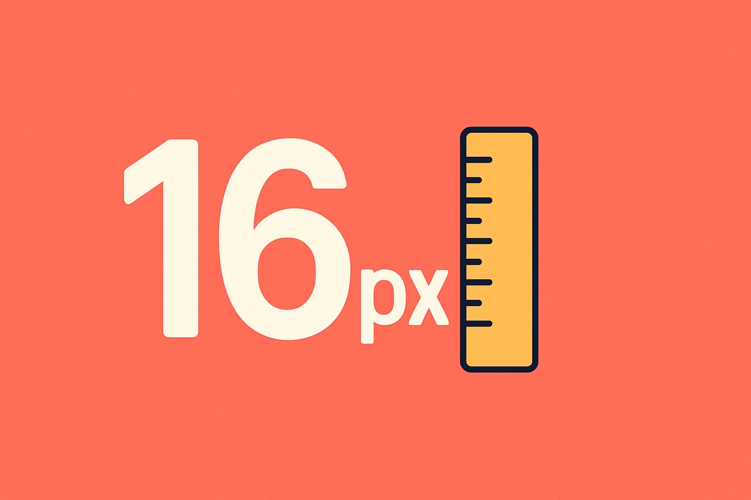
Small text is costing you customers. For better readability and accessibility, set your body text (the readable font sizes) to at least 16 px (or 1 em) and use em units instead of pixels so your site adapts to different screen sizes and zoom settings, especially on mobile. Add comfortable line spacing (about 1.5 em), and you’ll make your site easier to read, more trustworthy, and more effective. Let’s Chat if you’d like help making your website more readable and accessible.
If you’ve ever squinted at your own website and zoomed in, you’ve already felt the pain your customers feel. Readable font sizes, specifically a minimum of 16px, aren’t just a design trend; they’re a sales tool. In the next five minutes, I’ll show you why 16 pixels is the sweet spot, how it boosts accessibility and trust, and the simple line-spacing tricks that make paragraphs effortless to read.

Why 16 px Became the Baseline.
Mobile Phone Screens Set the Standard.
- Modern mobile browsers render 16px as the default body size.
- Anything smaller forces users to pinch-zoom, breaking the flow (and often their patience).
Glasses Are a Norm, Not the Exception.
- Nearly 1 in 4 Canadians over 40 live with vision impairment.
- Senior audiences, who often hold the purse strings, convert better when text is clearly legible.
Take-away: If visitors can’t read it comfortably, they won’t read it at all.
Accessibility = Better SEO and Bigger Markets.
- WCAG (Web Content Accessibility Guidelines) recommend text large enough to read at arm’s length on a phone.
- Search engines favour sites that follow accessibility best practices, meaning bigger text can lift rankings.
- By adopting 16px, you open your site to the 17% of Canadians (overall) with vision challenges and the growing senior demographic.
Line Spacing: Give Your Words Room to Breathe.
Font Size | Comfortable Line Height | Why It Works |
16px | 1.5 – 1.6 em | Prevents lines from blending together |
18px | 1.45 – 1.55 em | Keeps paragraphs compact yet airy |
20px | 1.4 – 1.5 em | Balances large text with vertical space |
Quick tip: multiply your font size by 1.5 and you’ll rarely go wrong.
Why You Should Use em Instead of px (Explained in Plain English).
Start with One Simple Rule
- Browsers treat 16 pixels as “1 em.”
- Think of 1 em as the default reading size, a bit like a standard coffee mug. Bigger fonts are just bigger “mugs” in the same cupboard.
What’s the Difference?
Unit | Think of it as… | How it behaves |
px (pixels) | A fixed-size sticker | Always the same size, no matter the screen or zoom level |
em | A rubber band | Expands or shrinks with the reader’s screen settings |
Why “Rubber-Band” Text Wins on Phones.
- Adapts to eye comfort: If visitors bump up text in their browser, everything sized in em stretches politely, no broken layouts.
- Future-proof: New devices keep changing their screen densities; em just rolls with it.
- Easier maths: Want headings twice as big as body text? Make them 2 em, no calculator needed.
Quick Conversion Cheat-Sheet.
If body text is… | …set it to | Set headings to* | And small-print to |
16 px | 1 em | 2 em (approx 32 px) | 0.875 em (approx14 px) |
18 px | 1.125 em | 2.25 em | 0.9 em |
* Headings at exactly 2 × body size feel balanced on both desktop and mobile.
A Quick Story
Imagine writing menu prices on a chalkboard using a Sharpie marker (that’s px). If the board shrinks, your prices won’t fit. Switch to chalk (that’s em): one swipe always feels the right thickness because chalk adapts to the board.
Bigger text isn’t just nicer, it’s profitable. By locking in 16px minimum (or 1 em) and using em units for scaling, your site becomes more readable, more accessible, and more persuasive.
Want help upgrading your typography, and letting our hosting team handle updates and daily backups?
👉 Let’s chat about making your website easy to read and even easier to trust.
FAQs
Why is 16 px considered the “new minimum” for body text?
Modern phones and laptops show 16 px as the default size that most people can read without zooming. Anything smaller forces visitors to squint or pinch-zoom, and many will simply leave.
How can I find out the font size my website is using?
Open any page, highlight a sentence, right-click, and choose “Inspect” (Brave/Chrome/Edge) or “Inspect Element” (Firefox). A small panel will pop up showing a number like font-size: 14px or font-size: 1em. If that number is under 16 px, it’s time to increase it.
My theme seems locked to 14 px. Do I need a new theme?
Not necessarily. Most themes let you adjust body text in Appearance → Customise → Typography (WordPress) or similar settings in other builders. Change the value to 1 em (which equals 16 px) or use the built-in slider to reach 16 px.
What’s the difference between “px” and “em” in non-tech terms?
px (pixels) are fixed, like sticking a label of exact size on every screen. em is flexible, like writing on a rubber band that stretches or shrinks with the viewer’s zoom setting.
Why should I switch to em instead of px for font sizes?
Text set in em automatically respects a visitor’s larger-text settings on mobile or desktop, so everyone gets comfortable reading without you redesigning the site for every device.
Will boosting font size mess up my layout?
Usually not if you also increase line spacing (set line-height to about 1.5 em). Bigger text plus extra breathing room keeps the design clean and prevents paragraphs from looking crammed.
What’s a quick “good enough” rule for headings?
Make your main heading (H1) about 2 em (roughly twice the body text) and sub-headings (H2) around 1.5 em. It keeps hierarchy clear without complicated maths.
Will larger fonts slow down my site?
No, font size doesn’t affect speed. Page load time depends on image weight, scripts, and hosting. Bigger text costs virtually nothing in performance.
Does readable text really help sales and SEO?
Yes. Search engines favour accessible sites, and people stay longer and convert better when they can read without effort, especially seniors and mobile users.