Key Takeaways
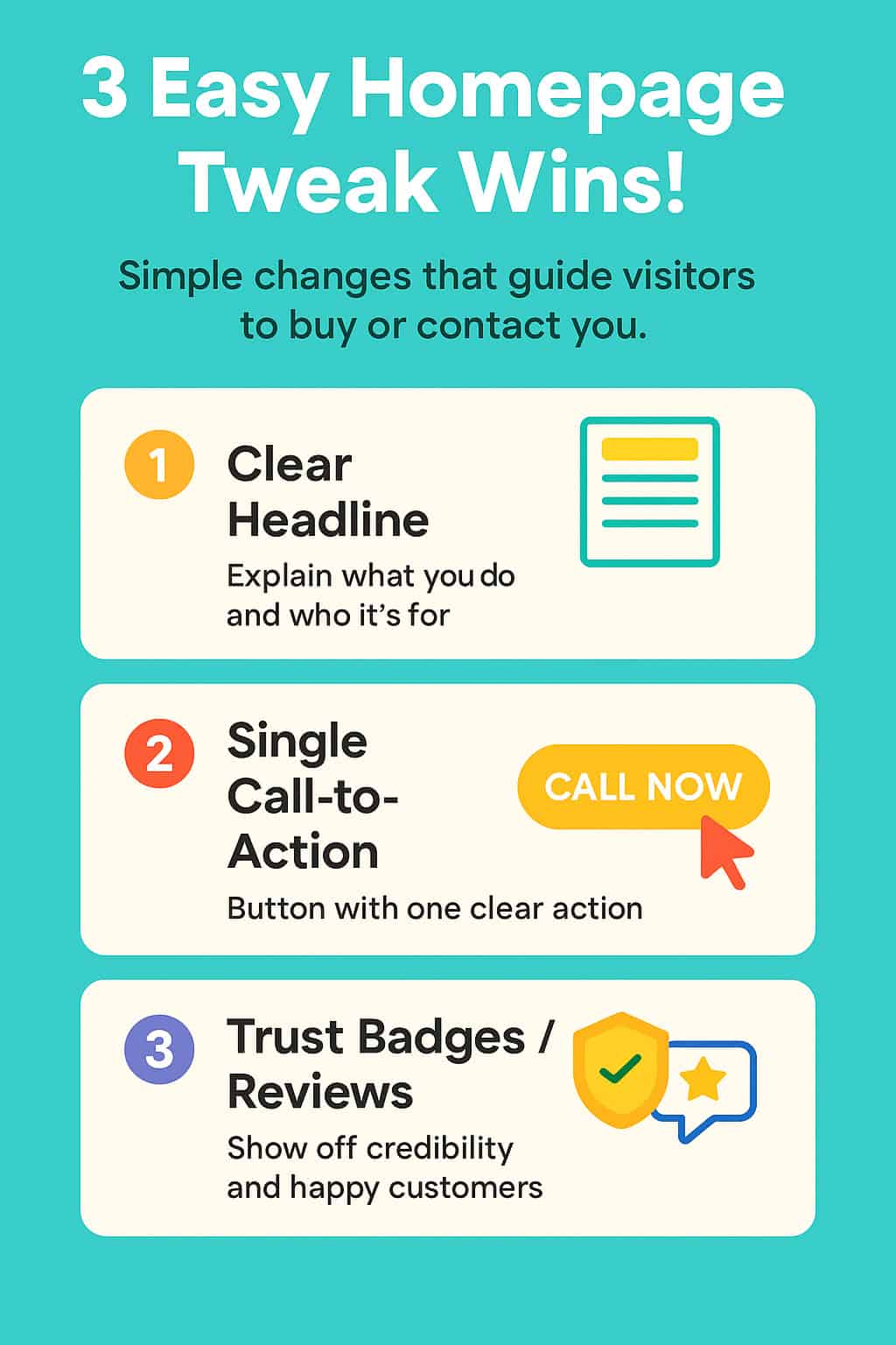
Nail your homepage with three quick tweaks
(1) a clear, benefit-packed headline and sub-headline,
(2) one standout call-to-action button, and
(3) visible trust badges or real customer reviews, and you’ll guide visitors straight from “just looking” to buying or calling. Ready for hands-free help? Let’s Chat and we’ll get it done while you focus on business.
You and I both know first impressions happen in a blink. A handful of quick homepage tweaks can steer visitors straight to your phone, checkout button, or “Book Now” link, before they wander off to a competitor. Below, I’ll show you how a sharp headline, a single laser-focused call-to-action, and visible trust badges work together to turn casual browsers into paying customers.

#1 – Lead with a Crystal-Clear Headline & Sub-Headline.
Nail the What and the Who.
- What you do (service or product)
- Who it’s for (ideal customer)
- How it helps (big benefit)
Example: “24-Hour Plumbing for Toronto Homeowners—Fast, Affordable, Guaranteed.”
Best Practices.
- Keep it under 12 words.
- Use large, contrasting typography so mobile users don’t pinch-zoom.
- Add a sub-headline for a quick proof point (e.g., “Rated ★★★★★ on Google from 120 reviews”).
- Follow with a sub-headline that answers “Why you?”: “Licensed pros, upfront pricing, and a 2-year workmanship guarantee.”
Practical Tips.
- Write benefits, not features (“24-hour fix” vs. “24-hour service”).
- Use a font size of at least 16 pixels so mobile viewers can read at a glance.
- Add a subtle background contrast (e.g., light grey strip) to make the headline pop.
#2 – Highlight One Primary Call-to-Action.
Less Choice = More Clicks.
According to a HubSpot study, pages with a single dominant CTA get 1.6× more clicks than pages with multiple competing buttons.
How to Implement.
- Pick the money maker: “Book a Call Now”, “Get a Quote Now”, or “Buy Now”.
- Use a contrasting colour (but stay on-brand).
- Repeat the CTA above the fold and halfway down the page.
- Label the button with an action verb: “Get Instant Quote” outperforms “Submit.”
- Multiple buttons create decision fatigue. Instead, pick one main action.
- Micro-copy: Start with a verb and add urgency: “Book Your Free Call – Spots Fill Fast.”
#3 – Add Trust Badges & Real Reviews.
Why They Matter.
Social proof removes doubt. Nielsen reports 92% of people trust user reviews over ads.
Quick Wins
- Display 3-4 logo badges (e.g., BBB Accredited, Chamber of Commerce, secure payment).
- Embed your best Google or Facebook reviews with headshots if possible.
- Place badges near the CTA for an immediate confidence boost.
- Add one more example badge (e.g., “Google Reviews ★4.9”) to show digital proof, not just payment/security.
Reduce Buyer Anxiety.
Seeing logos from Visa, BBB, or local chambers instantly boosts credibility. Pair those with authentic reviews to seal the deal.
Bringing the Tweaks Together.
Tweak | Where it Lives | Primary Goal |
Headline & Sub-headline | Top hero section | Instant clarity |
Single CTA | Hero button + mid-page | Direct action |
Trust Badges & Reviews | Beside or beneath CTA | Build confidence |
A clear message, one path to act, and proof you’re legit; those three elements make up the conversion “triangle” that keeps eyes, clicks, taps, and wallets focused on you.
By sharpening your headline, spotlighting one action button, and flaunting social proof, you’ll guide visitors exactly where you want them to go, straight to your checkout or phone line. Think of these homepage tweaks as the low-hanging fruit that drives serious revenue.
Ready for hands-on help?
👉 Let’s chat about boosting your homepage while we keep branding and CTA on-point.
FAQs
Do I really need to change my homepage if I already have one?
Yes, for many website small tweaks can make a big difference. Even if your homepage looks fine, simplifying your message and making your call-to-action (CTA) more obvious can lead to more sales or calls.
What should my homepage headline say?
Your headline should quickly answer what you do, who it’s for, and why it helps. Example: “Custom Landscaping for Toronto Homes – On Time and On Budget.”
How many call-to-action (CTA) buttons should I have?
Just one primary CTA on your homepage. Too many buttons confuse visitors. Stick with one clear action like “Book a Consultation Now” or “Get a Free Quote Now”.
Where should I put trust badges and reviews?
Place them right below your main CTA button or near the bottom of your homepage. They boost confidence at the moment a visitor is deciding whether to act.
What kind of trust badges should I use?
Use ones that show credibility:
– Google Reviews (with rating stars).
– BBB Accredited logo.
– “100 % Satisfaction Guaranteed”.
– Payment security icons (if you sell online).My business doesn’t have reviews yet, what can I show?
Use a short testimonial quote from a happy customer, or show photos of past work or logos of companies you’ve worked with. Even one good review is better than none.
What if I’m not sure which tweaks to make first?
Start with your headline. It’s the first thing visitors see. Then check your CTA, make sure it’s clear, easy to find, and action-oriented.
How do I test if my homepage is working better after the changes?
Track:
– How many people click your CTA button
– How many enquiries or calls you get
– Bounce rate (how many leave right away)
If those numbers go up, your tweaks are working.

